RECONNECT is an awareness campaign inspired by Netflix’s documentary ‘The Social Dilemma’. Using stark images and bold typography, the campaign explores the impact of social media on mental health, behaviour and human connection.
Conceptual Client : Center for Humane Technology
Discipline : Branding / Campaign / Art Direction
Project Type : Self-Directed Concept
Initial Logo Concept.
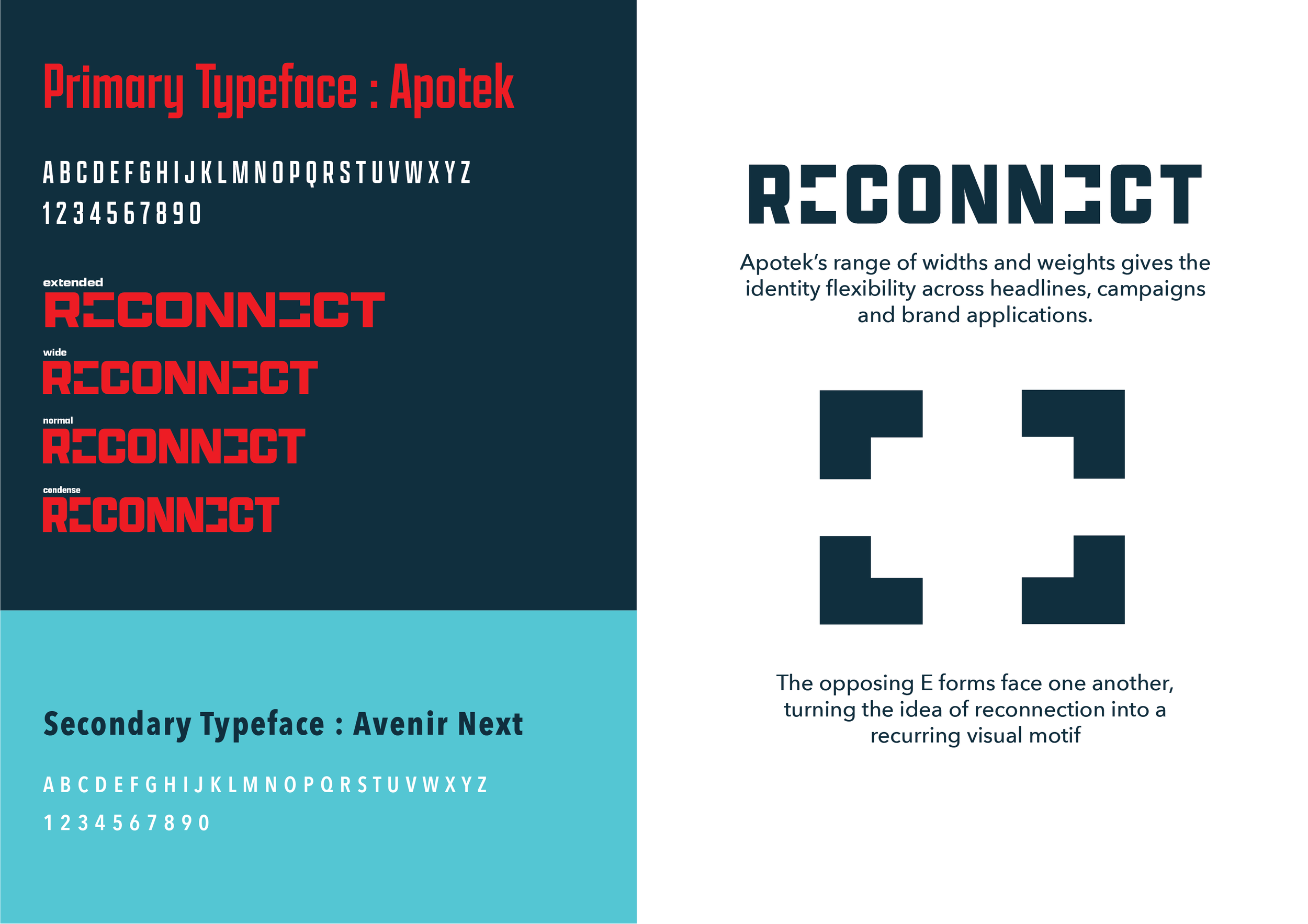
Final Logo Concept.
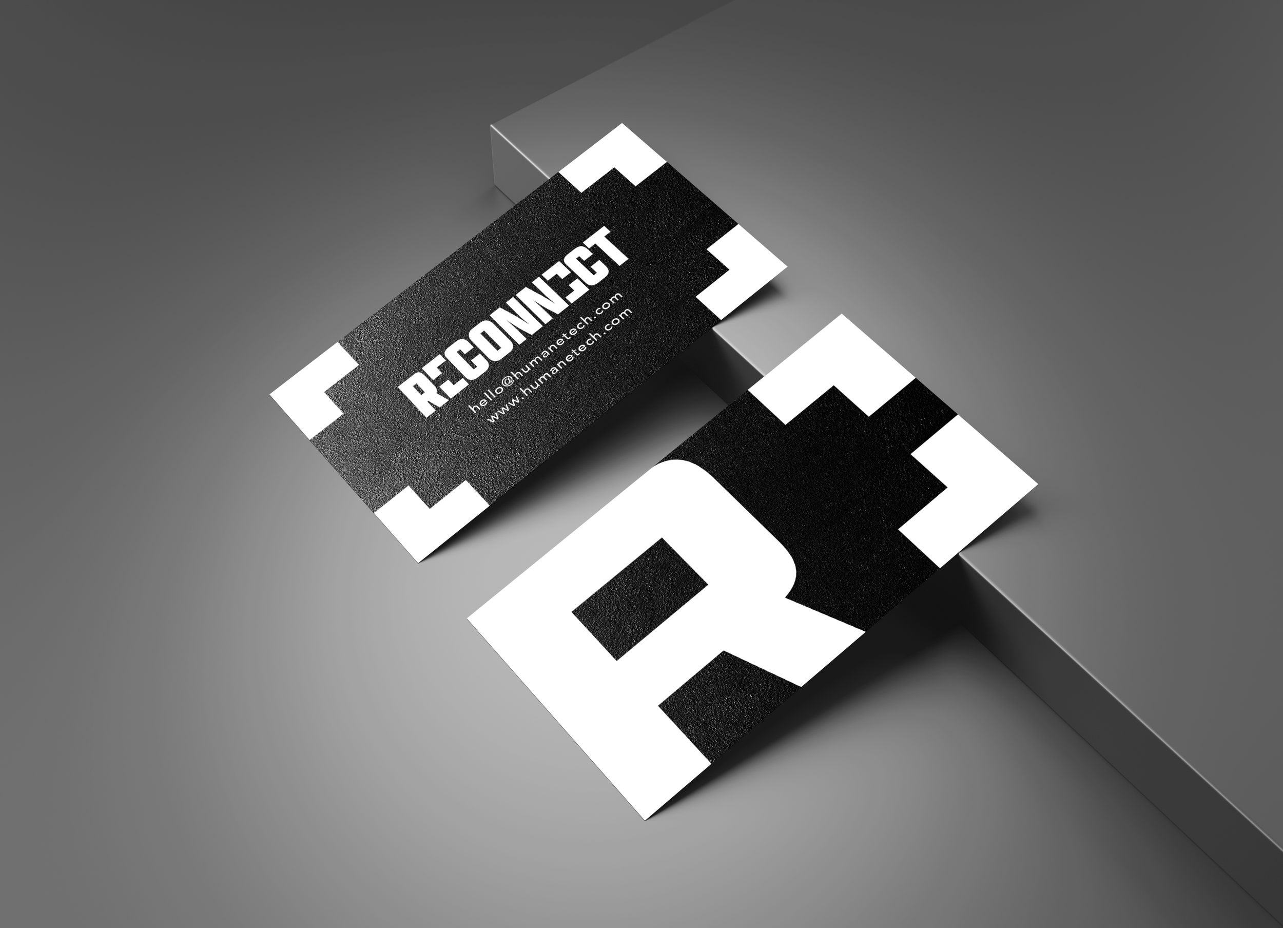
Poster Mockups.
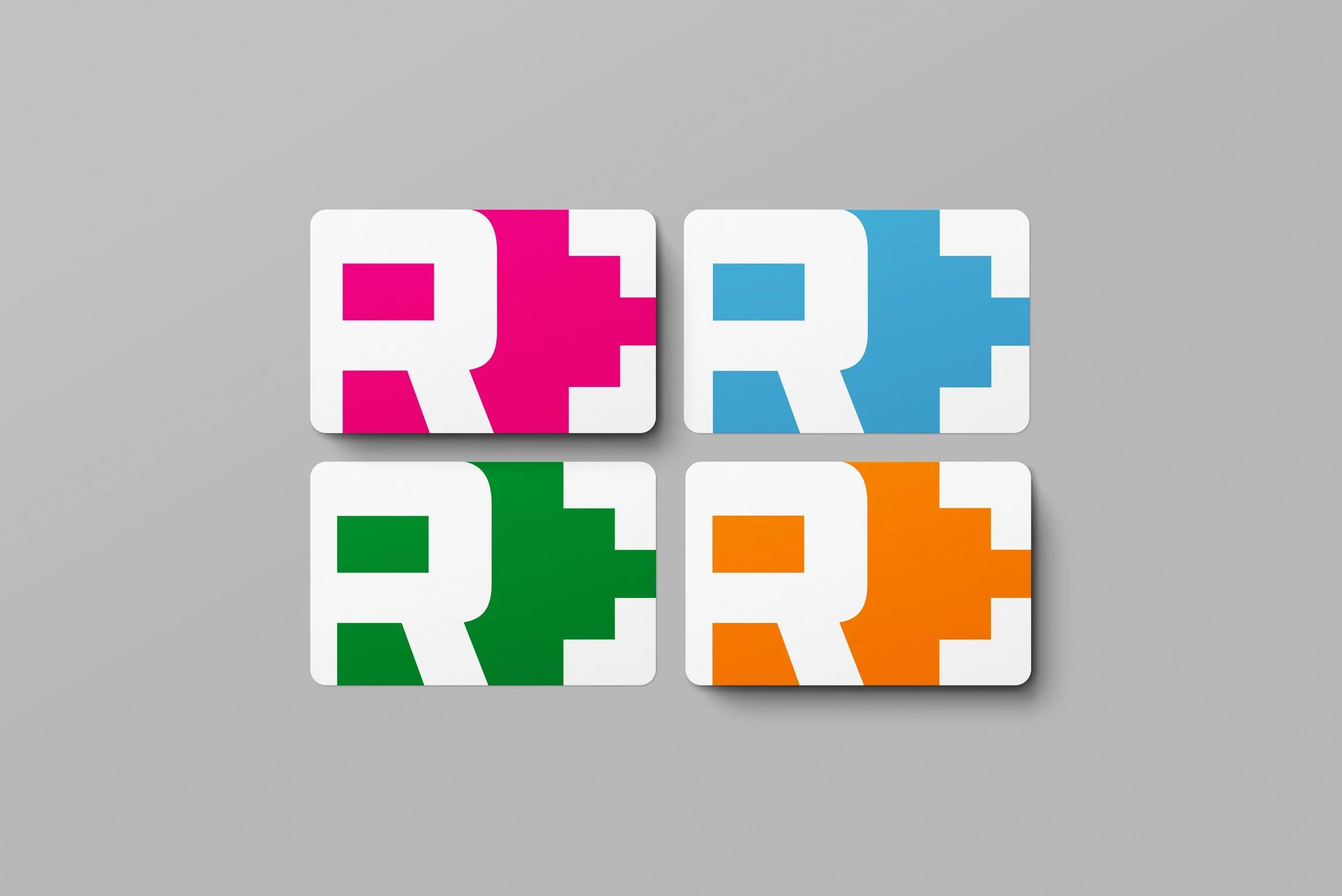
The challenge was balancing a serious message with a visual approach that felt bold rather than preachy. I focused on simple metaphors, strong typography and minimal copy to make the campaign immediate, memorable and easy to read.
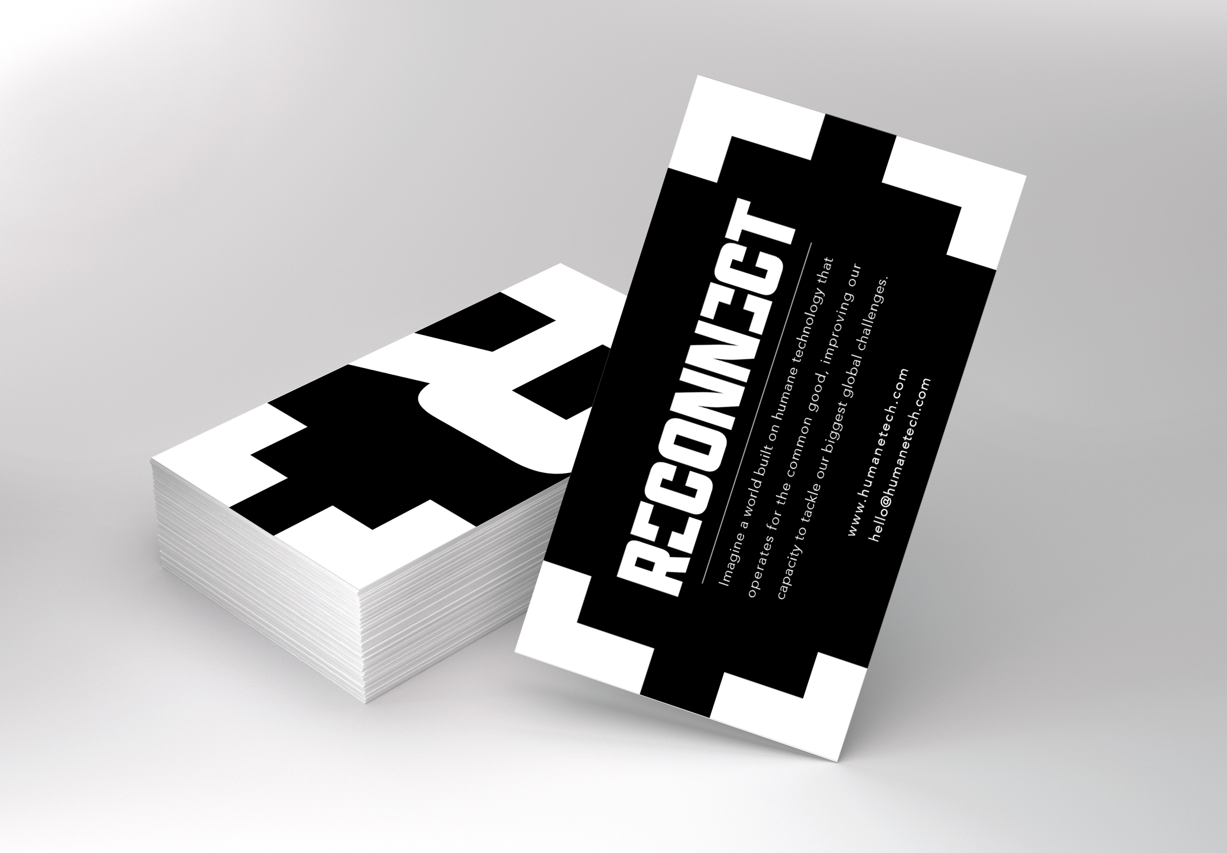
Final Poster Concepts. Designed 23/09/2026
My First Hostel Job.
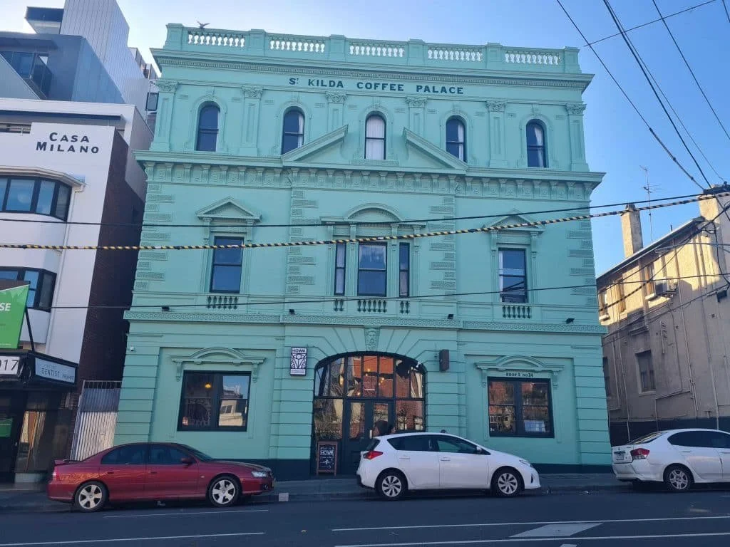
After moving to Melbourne, I began working for accommodation at the Selina St Kilda Hostel. After some time, I became the hostel’s in-house graphic designer. This involved designing menus, posters, signs, etc.
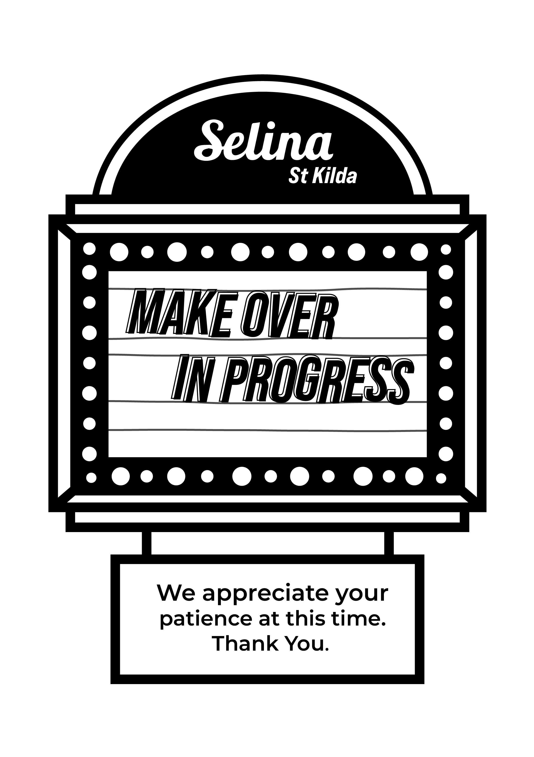
Out Of Order Sign.
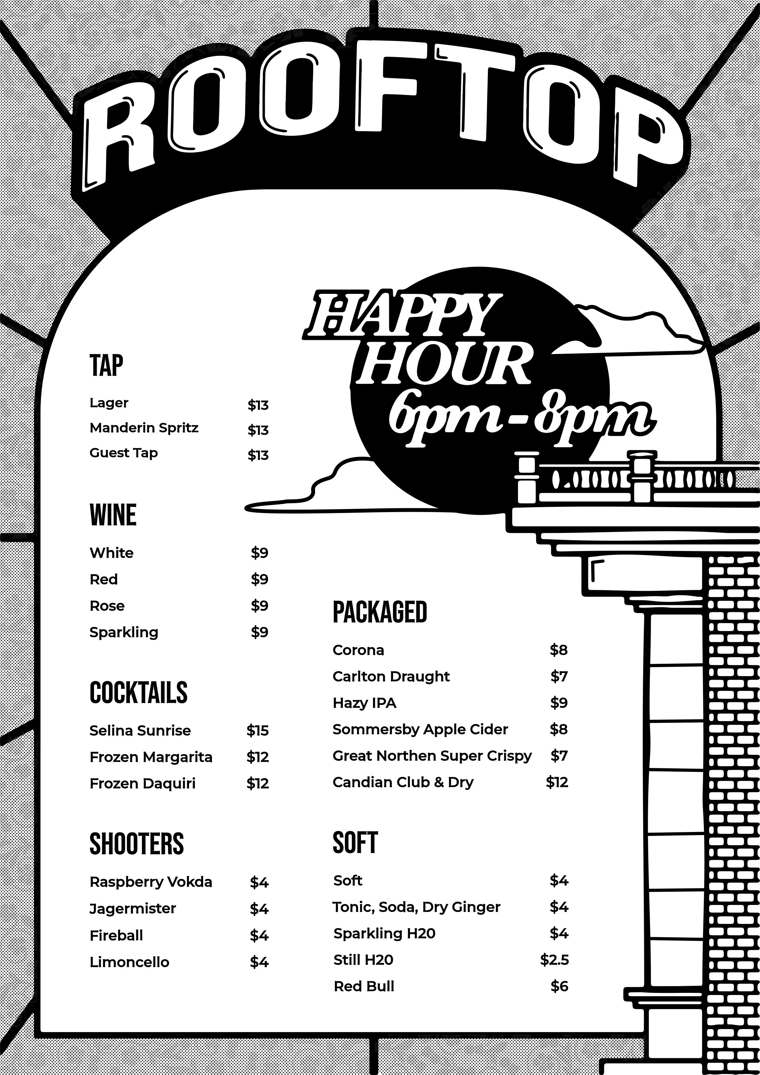
Roof Bar Menu.
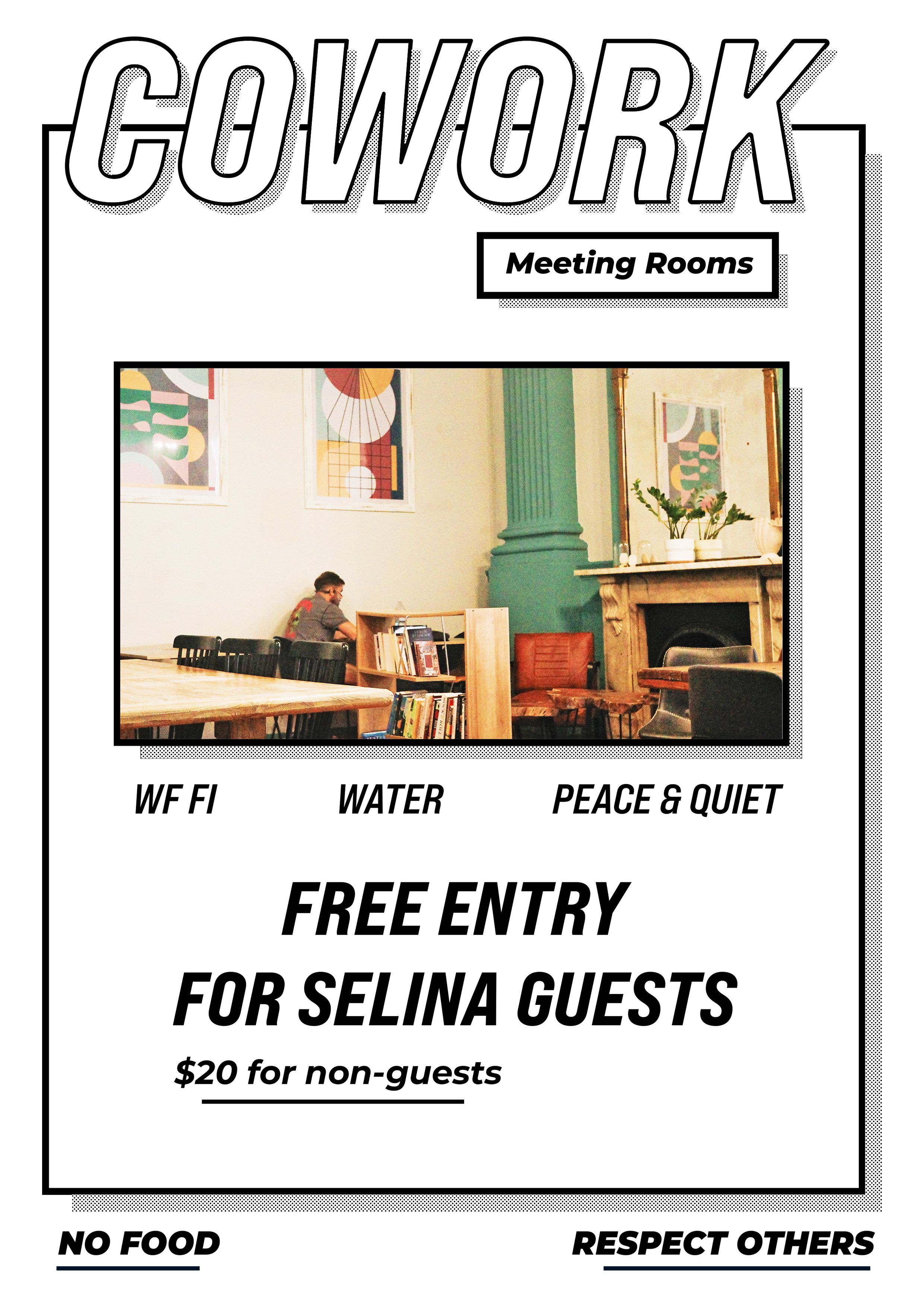
Study Room Sign.
Guidelines.
After producing some initial designs, I was provided with Selina's official brand guidelines and a collection of existing assets from their design team. I then went back and adapted the work to fit their established visual identity.
New Designs Within Brand Guidelines.
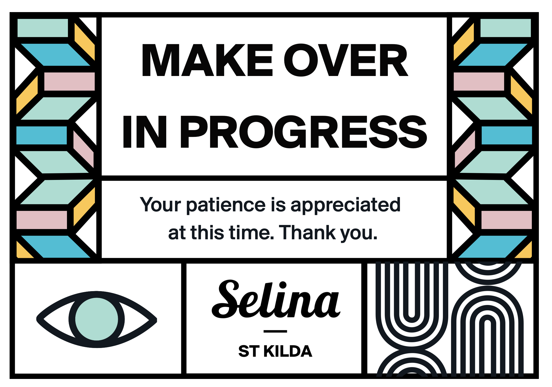
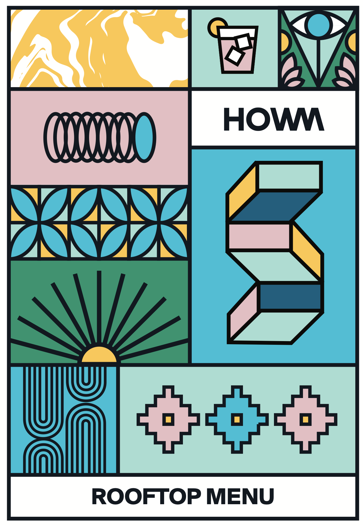
Roof Bar Menu Front.
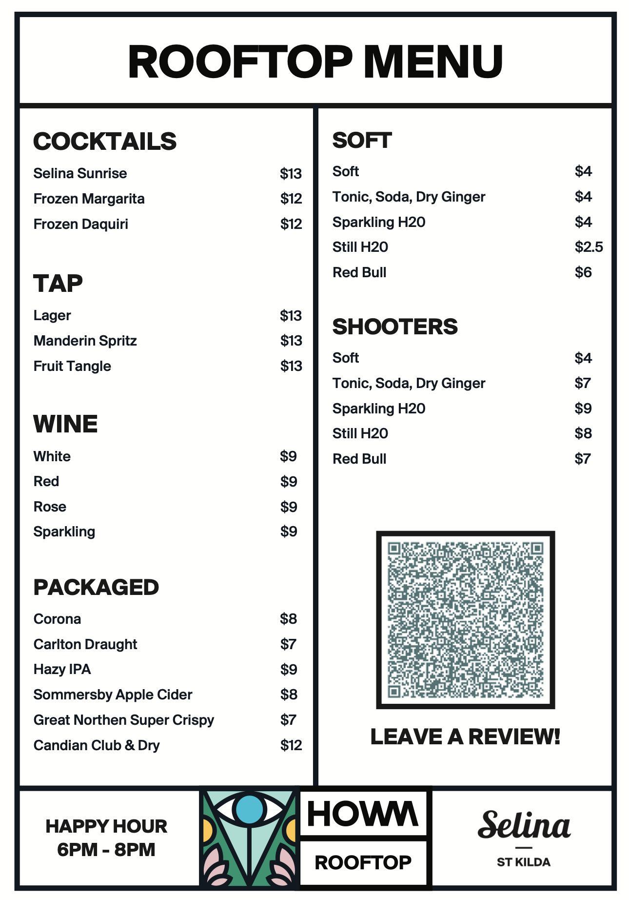
Roof Bar Menu Back.
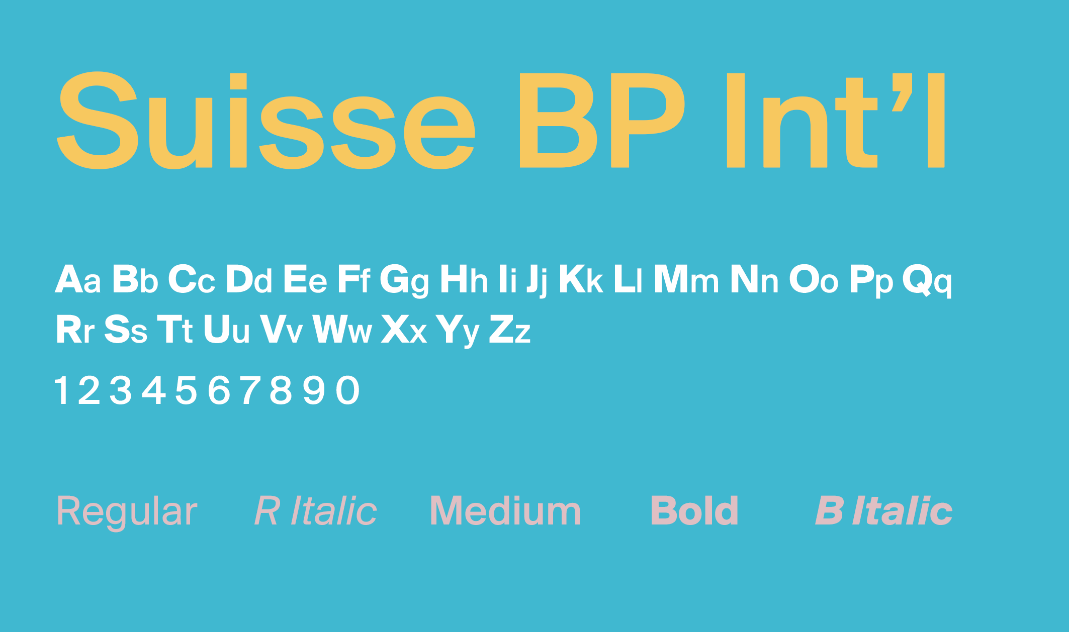
Brand Typeface.
Out Of Order Sign.
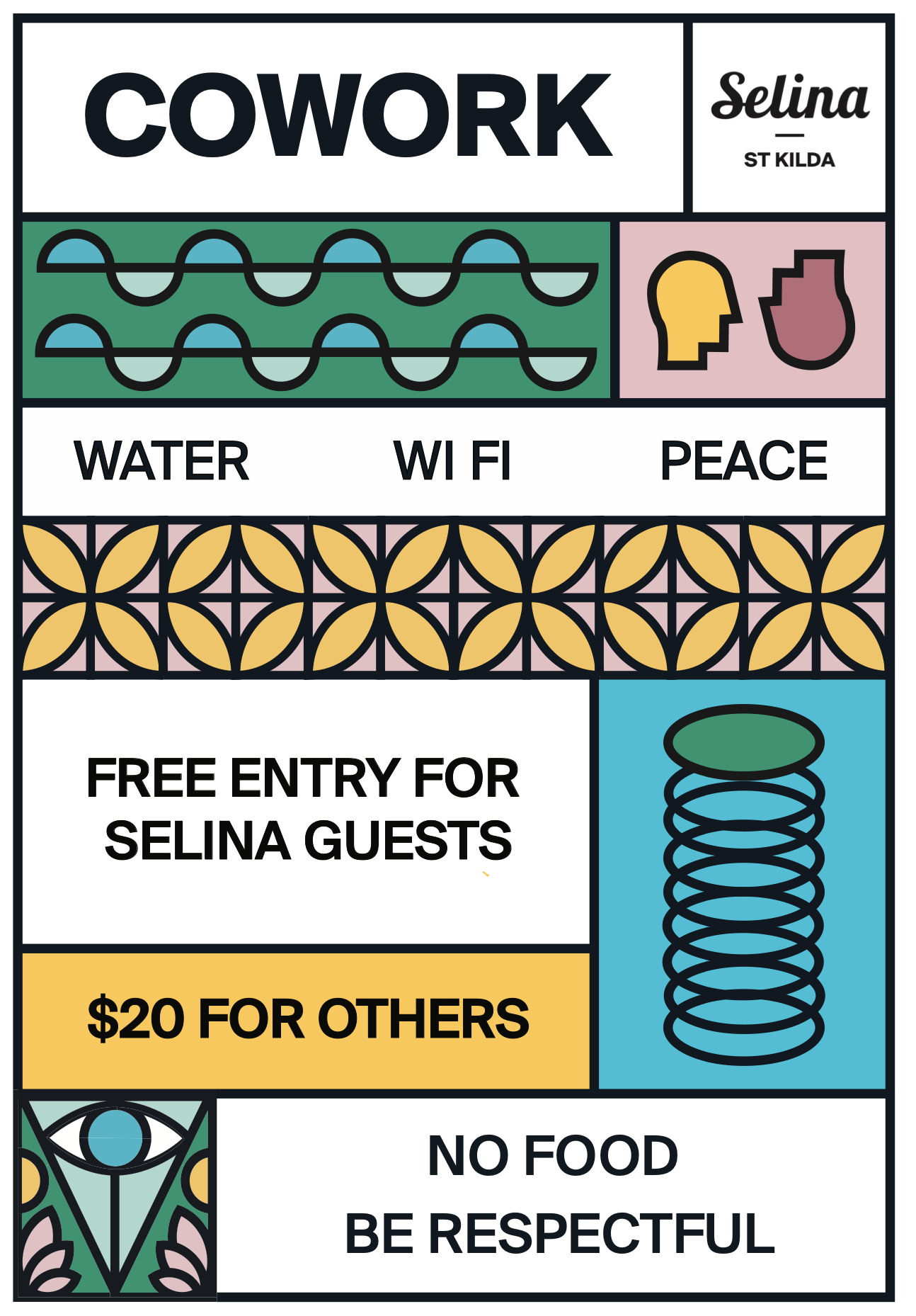
Study Room Sign.
Although most of my design work was completed using Adobe Creative Suite, I occasionally had to adapt to other software depending on the requirements of the project. For this weekly promotional planner, I was provided with an existing Canva Video Editor template by Selina's marketing team. I used this to create promotional content while keeping everything consistent with their established branding.
Admittedly, Canva wouldn't be my first choice, but sometimes you've got to work with the tools you're given!
Further Design Collateral.
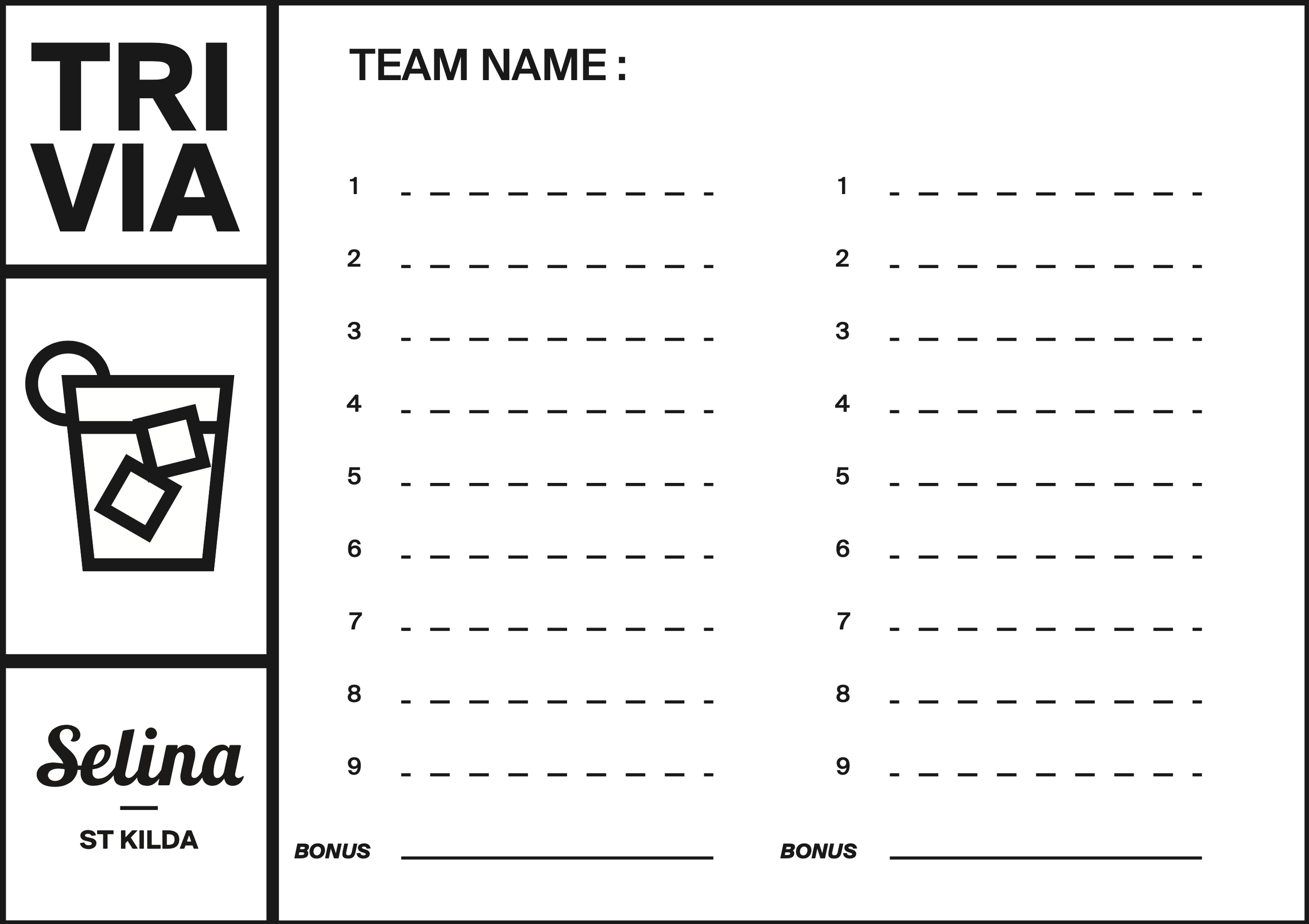
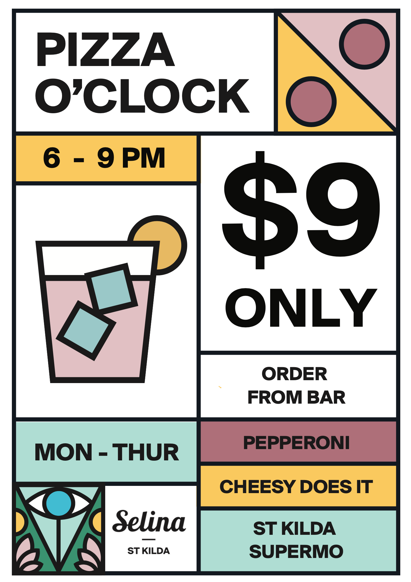
Pub Grub Menu.
Rent a Skateboard Poster.
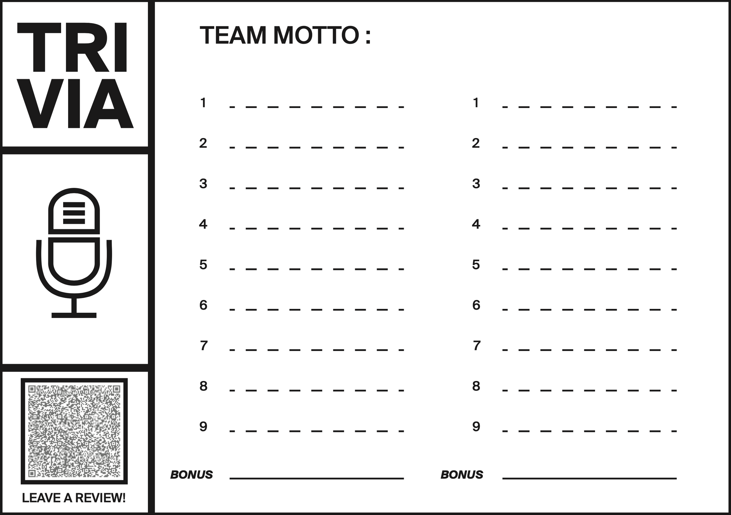
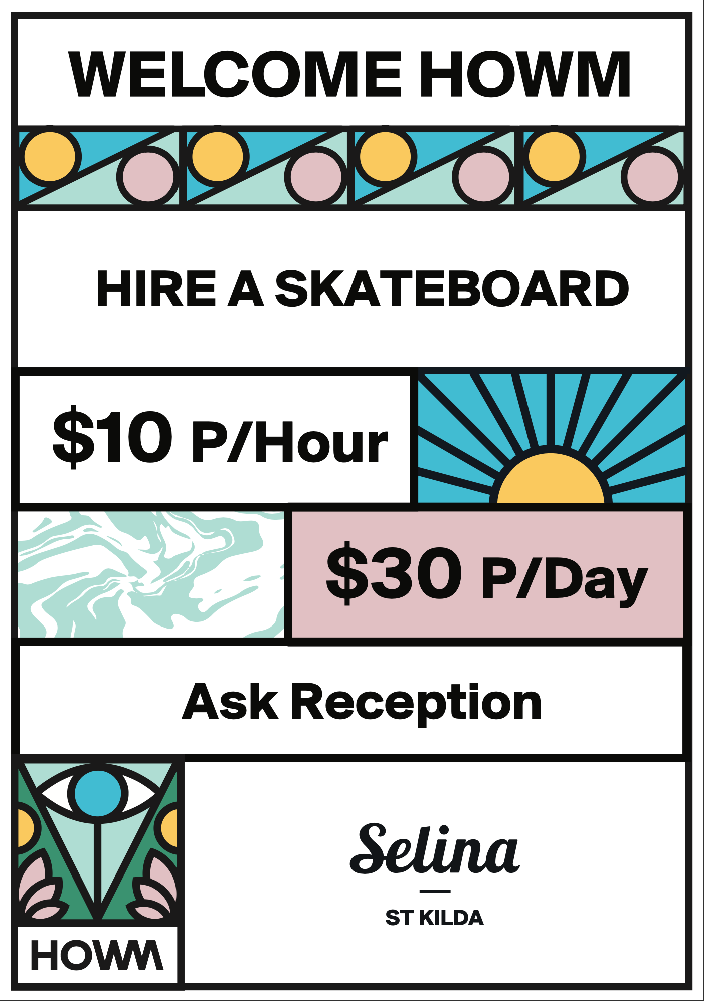
Pub Quiz Answer Card Front.
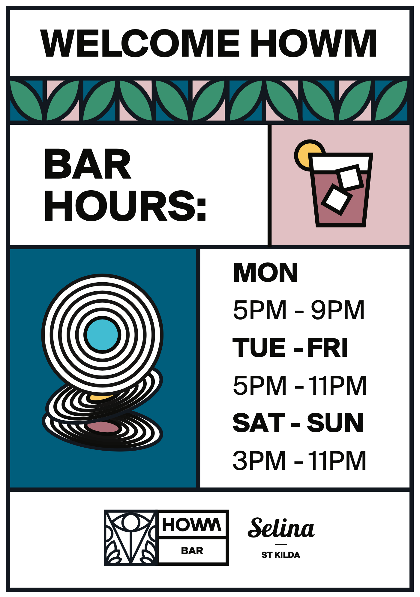
Bar Opening Times.
Kitchen Opening Times.
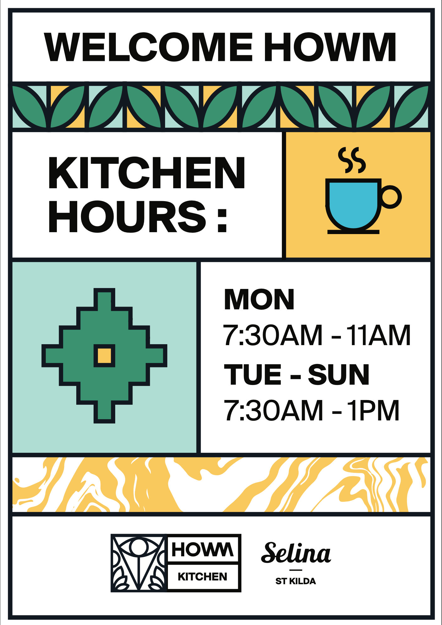
Pub Quiz Answer Card Back.
The finished designs were approved by the marketing team and went on to be used throughout the venue. This was a great opportunity to get some experience working within an established brand, using guidelines and assets provided by another designer. It was a good exercise in finding ways to bring my own ideas into the work while keeping everything consistent with the company's existing visual style.
CLUB NIGHT SERIES.
SMART CASUAL is a club night founded by Al Mckay (Et Al) and Dan Leggett (Test Press). An electronic club night revolving around, loose dress codes and not taking yourself too seriously. The identity plays on that contrast. Formal enough to feel intentional, but still loud, playful and a bit messy.
Client : Smart Casual
Discipline : Branding / Campaign / Art Direction
Project Type : Music Promotion
Each event needed its own visual identity without losing the character of Smart Casual. Over time, the recurring shoe became the real brand device — allowing the posters to constantly change in style, colour and composition while still belonging to the same club night.
Exceed LinkedIn Banner Advert.
LinkedIn banner ad for Exceed, designed around a client testimonial to highlight reliability, expertise and support.
Client : Exceed MPR
Discipline : Motion Graphics
Project Type : Social Banner
Stag’s Breath Social Advert.
Promotional social graphic inviting customers to submit their own summer cocktail recipe, using bold typography and hand-drawn details to keep the campaign playful and approachable.
Client : Stag’s Breath
Discipline : Motion Graphics
Project Type : Web Ad
Fierce Beer Trailer.
Short commercial for the Edinburgh Film Festival. Using punchy typography and movement to match the brand’s gritty aesthetic.
Client : Fierce
Discipline : Motion Graphics
Project Type : Film Trailer
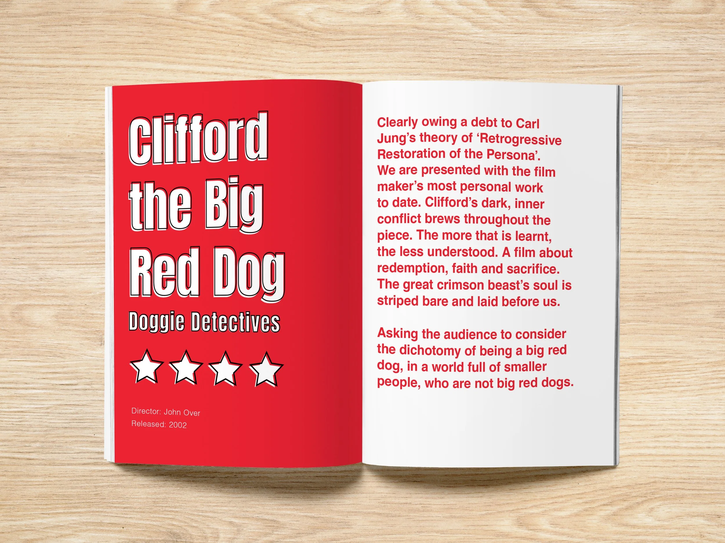
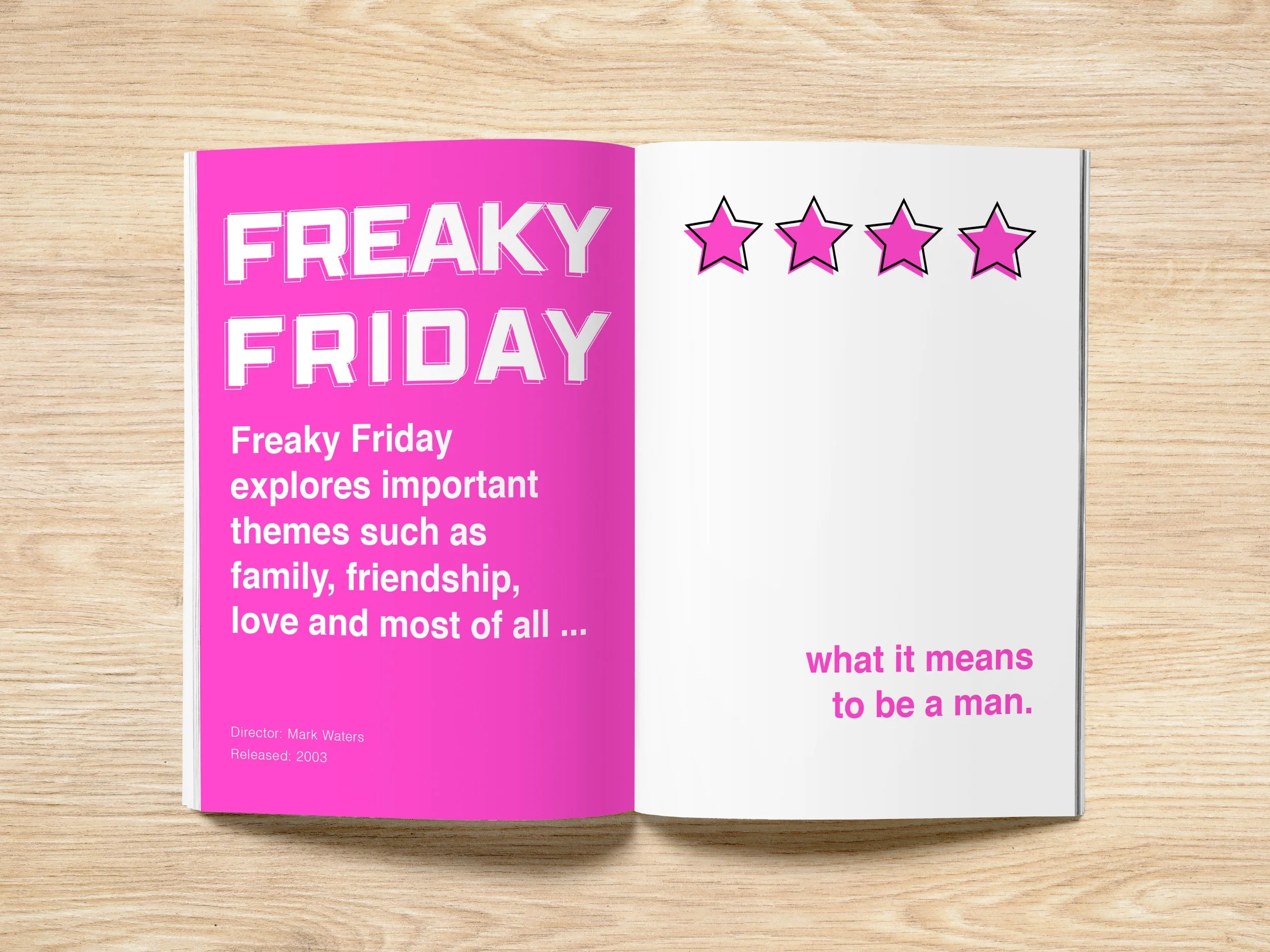
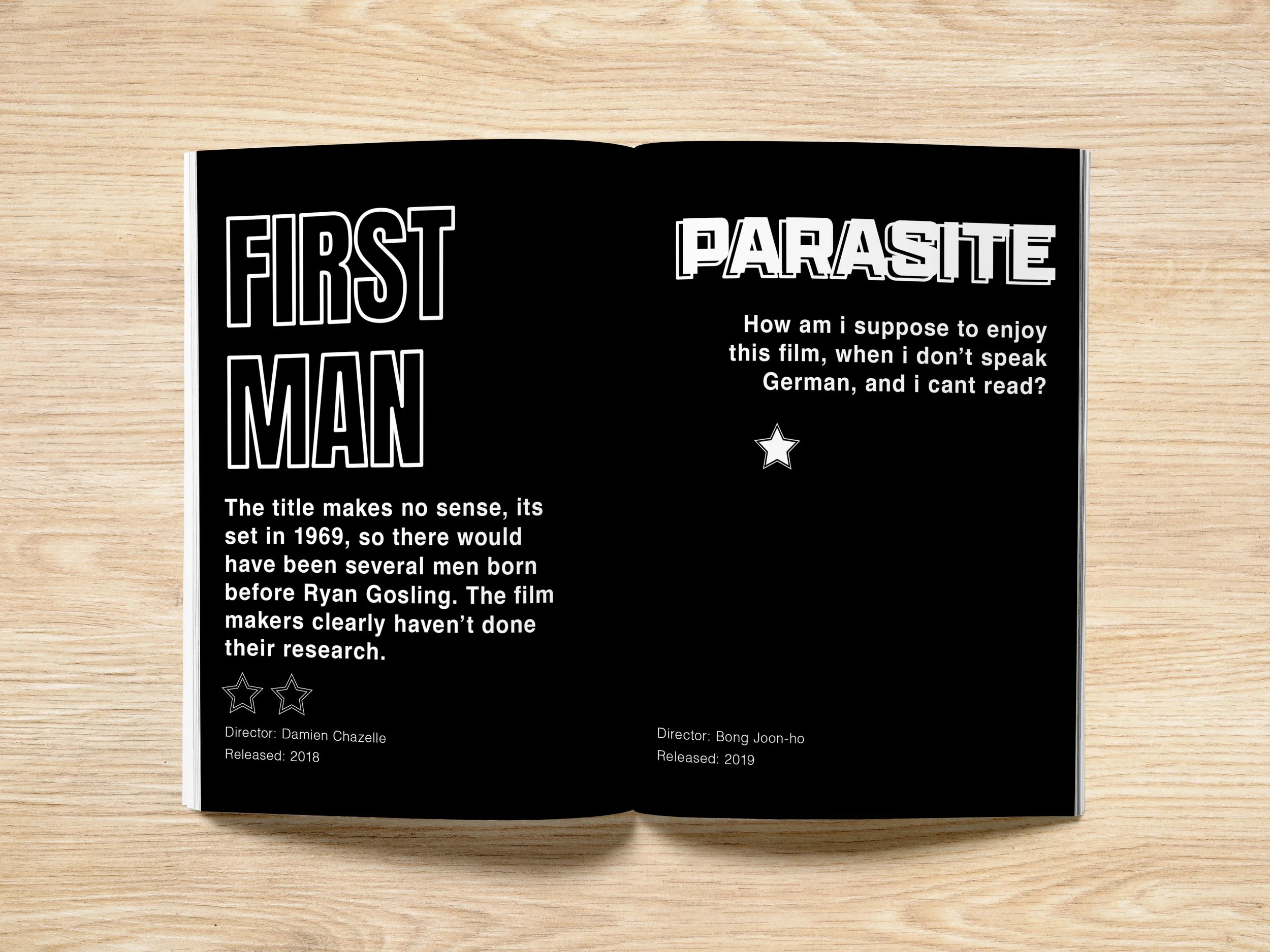
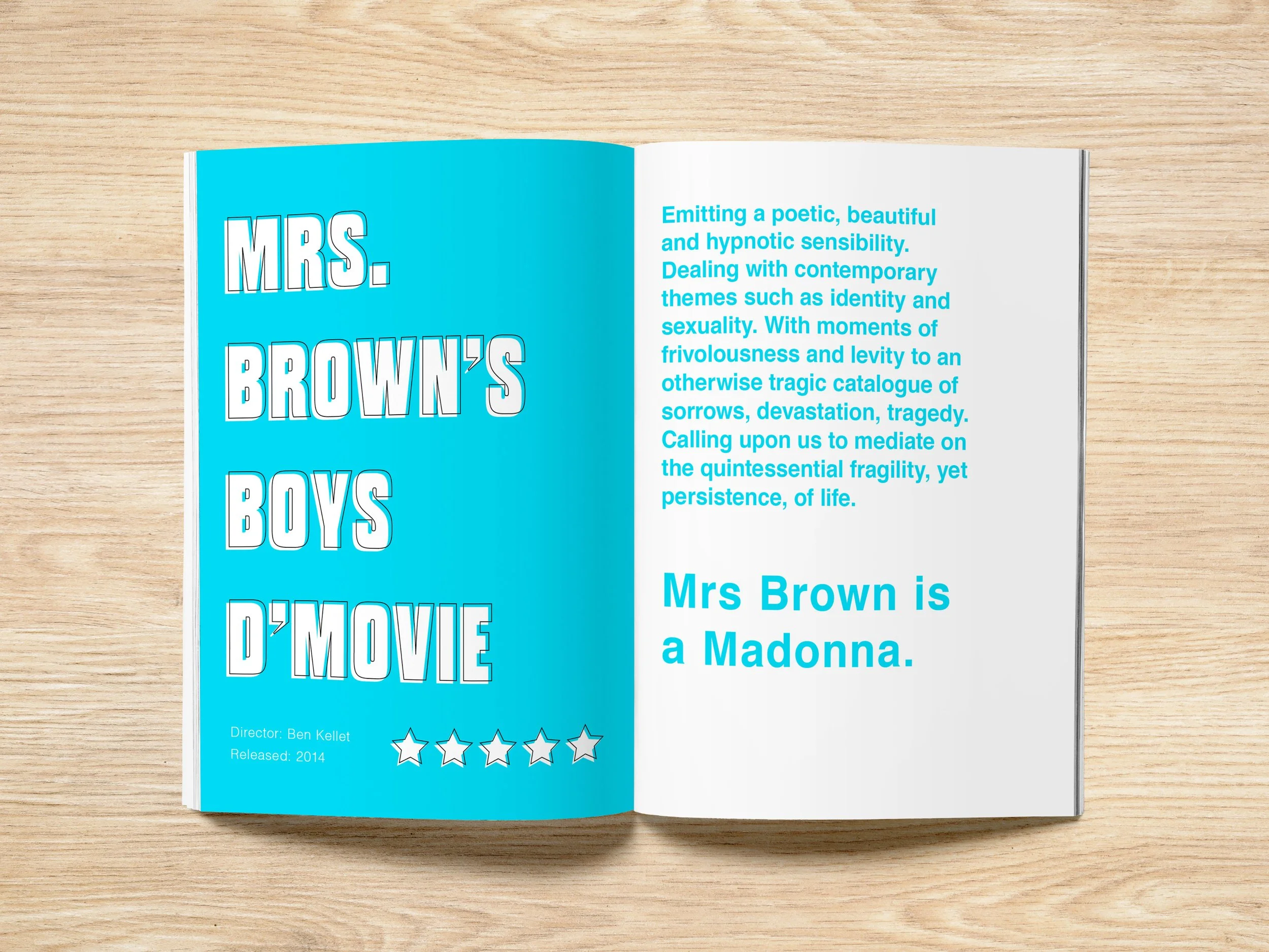
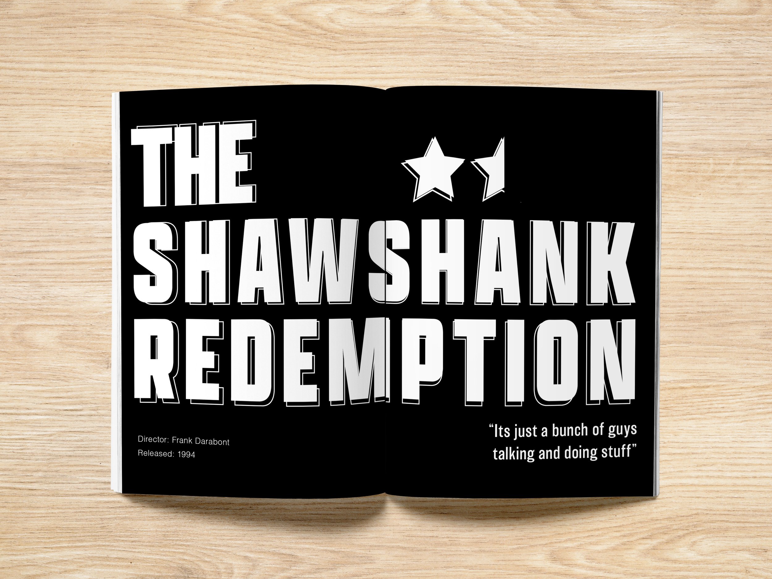
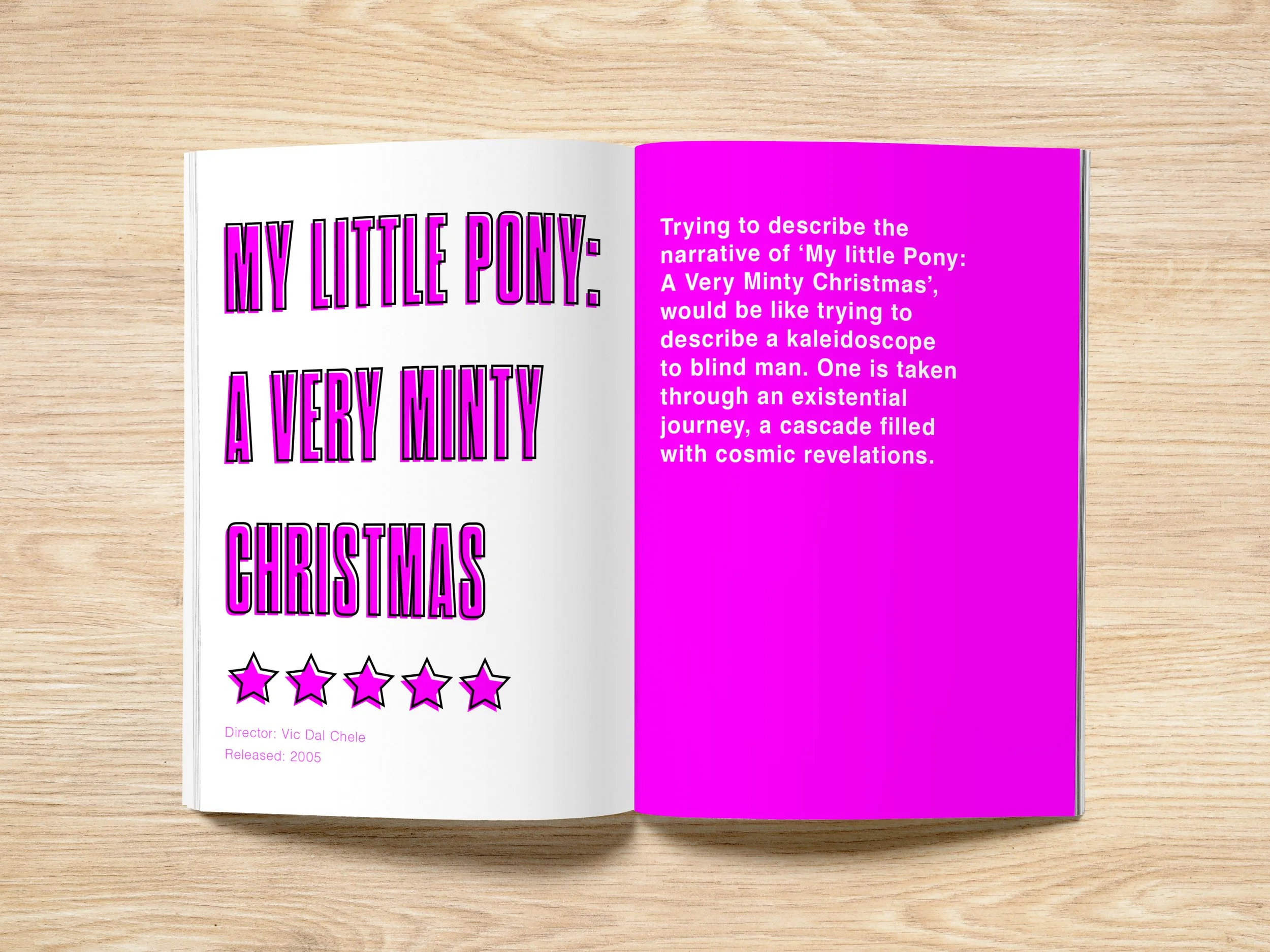
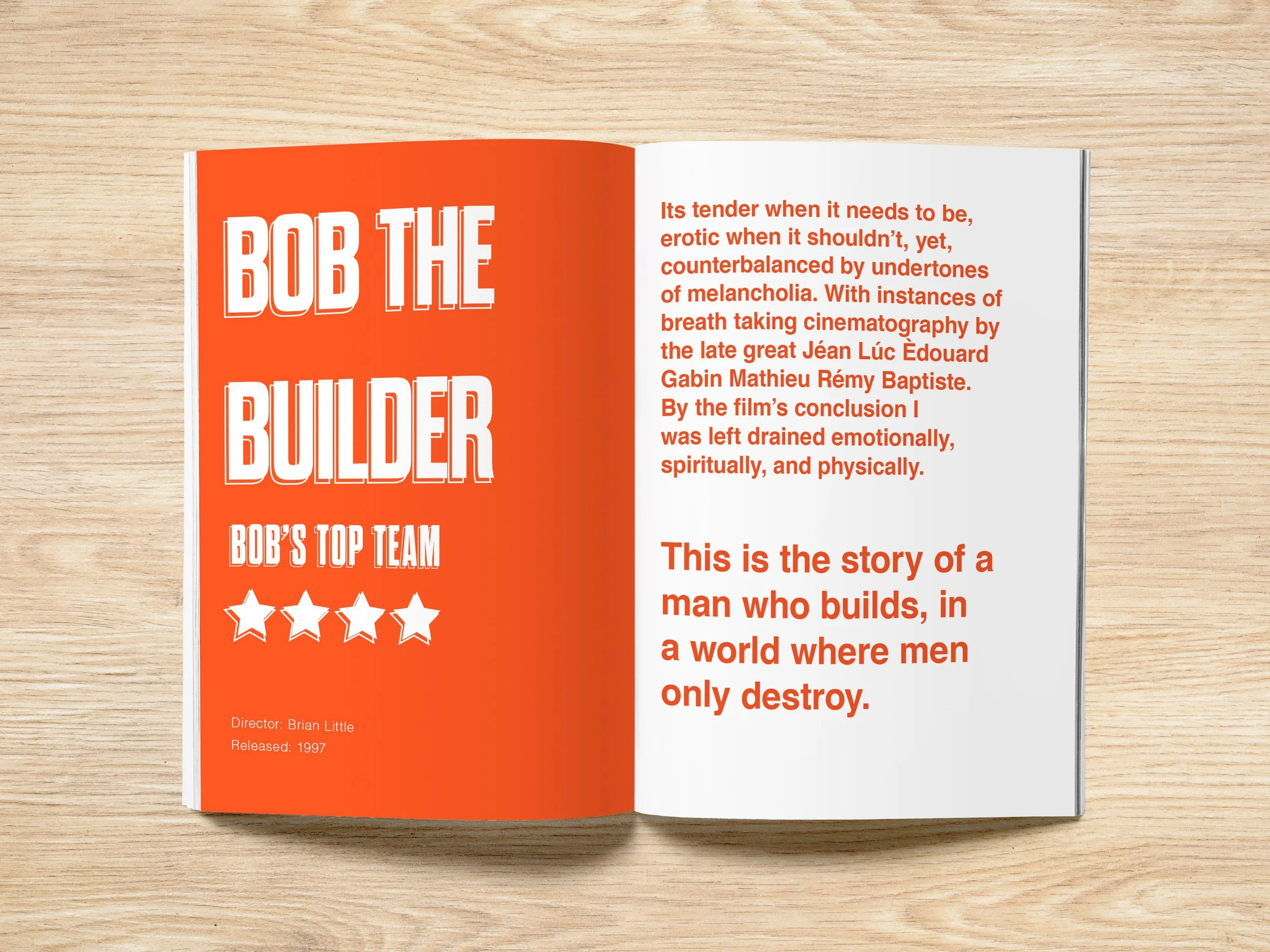
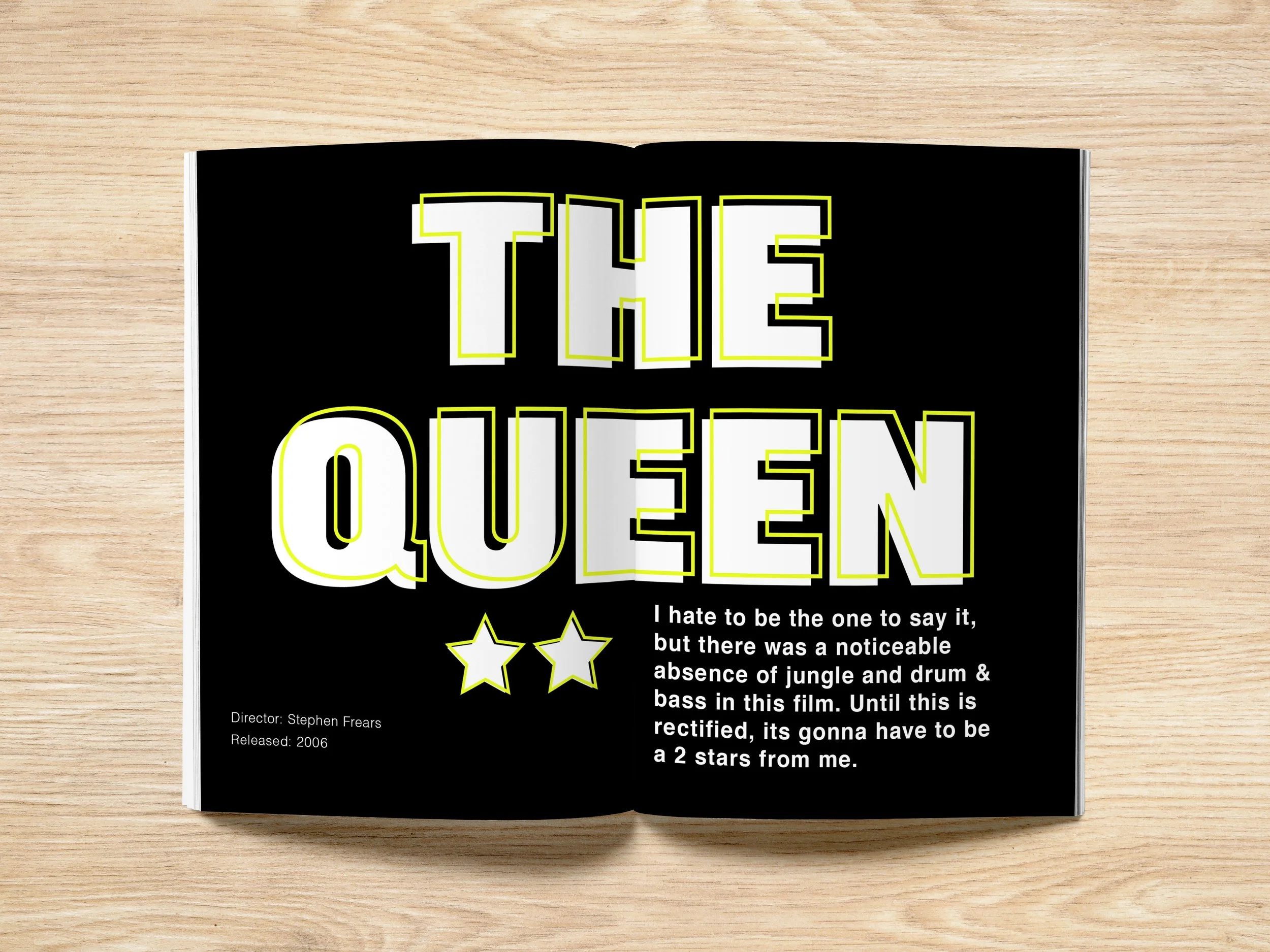
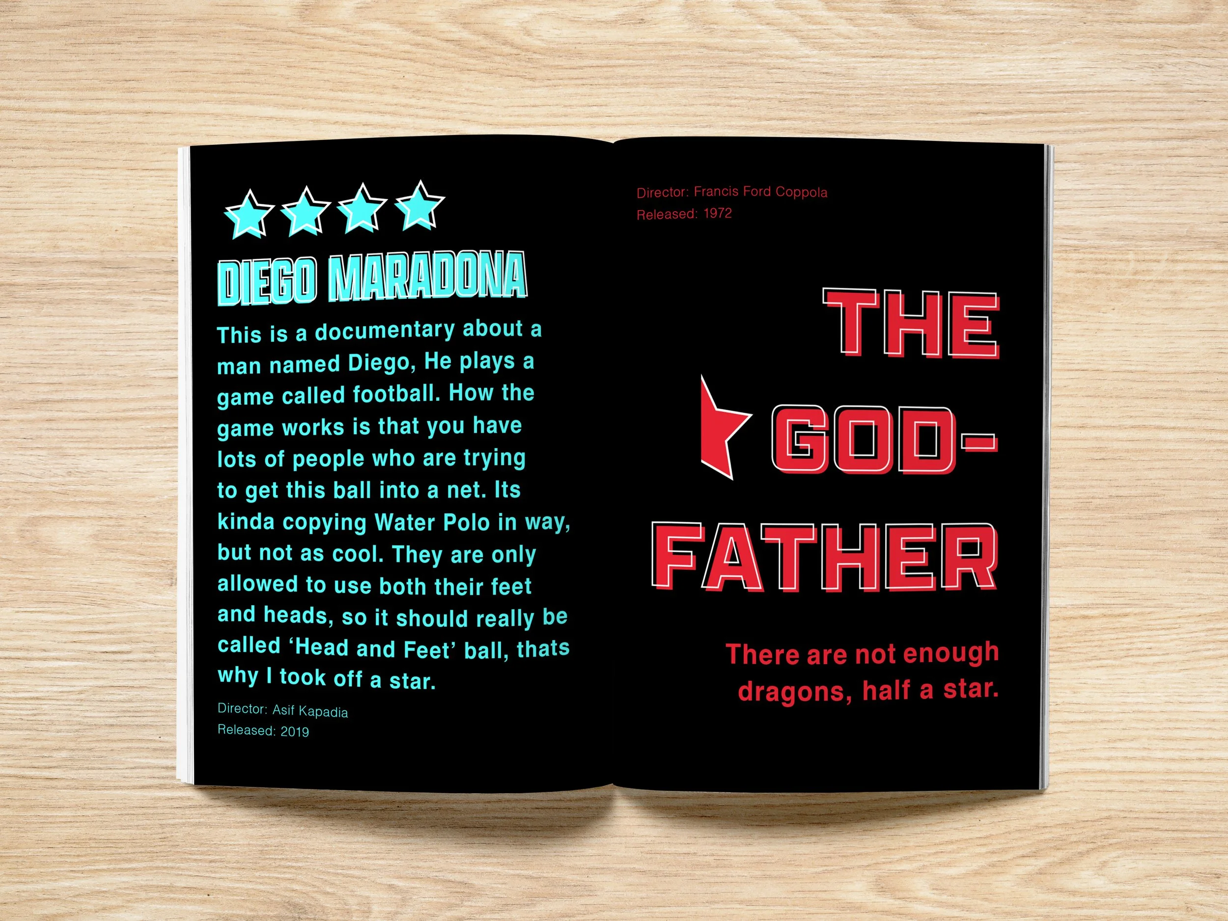
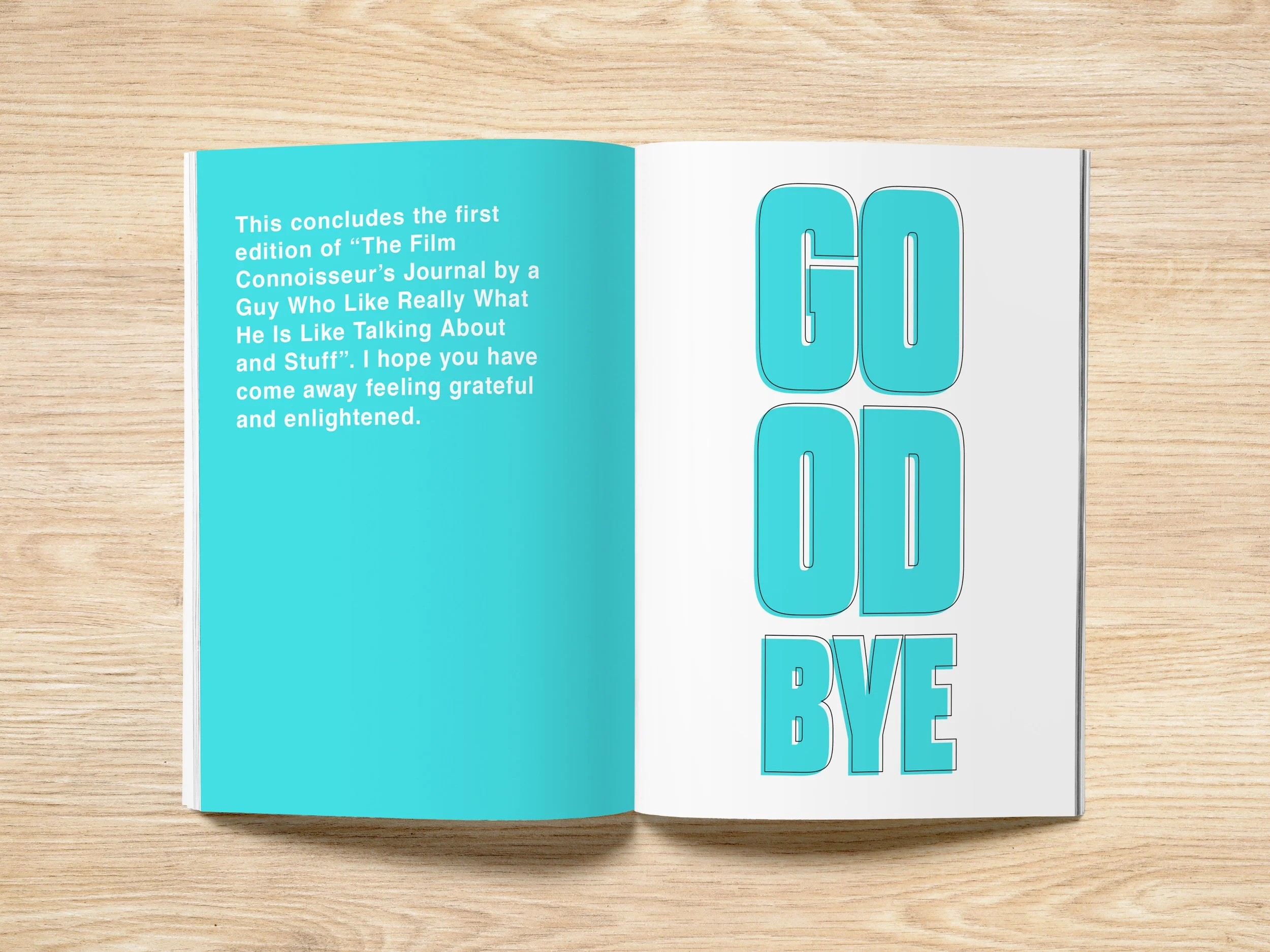
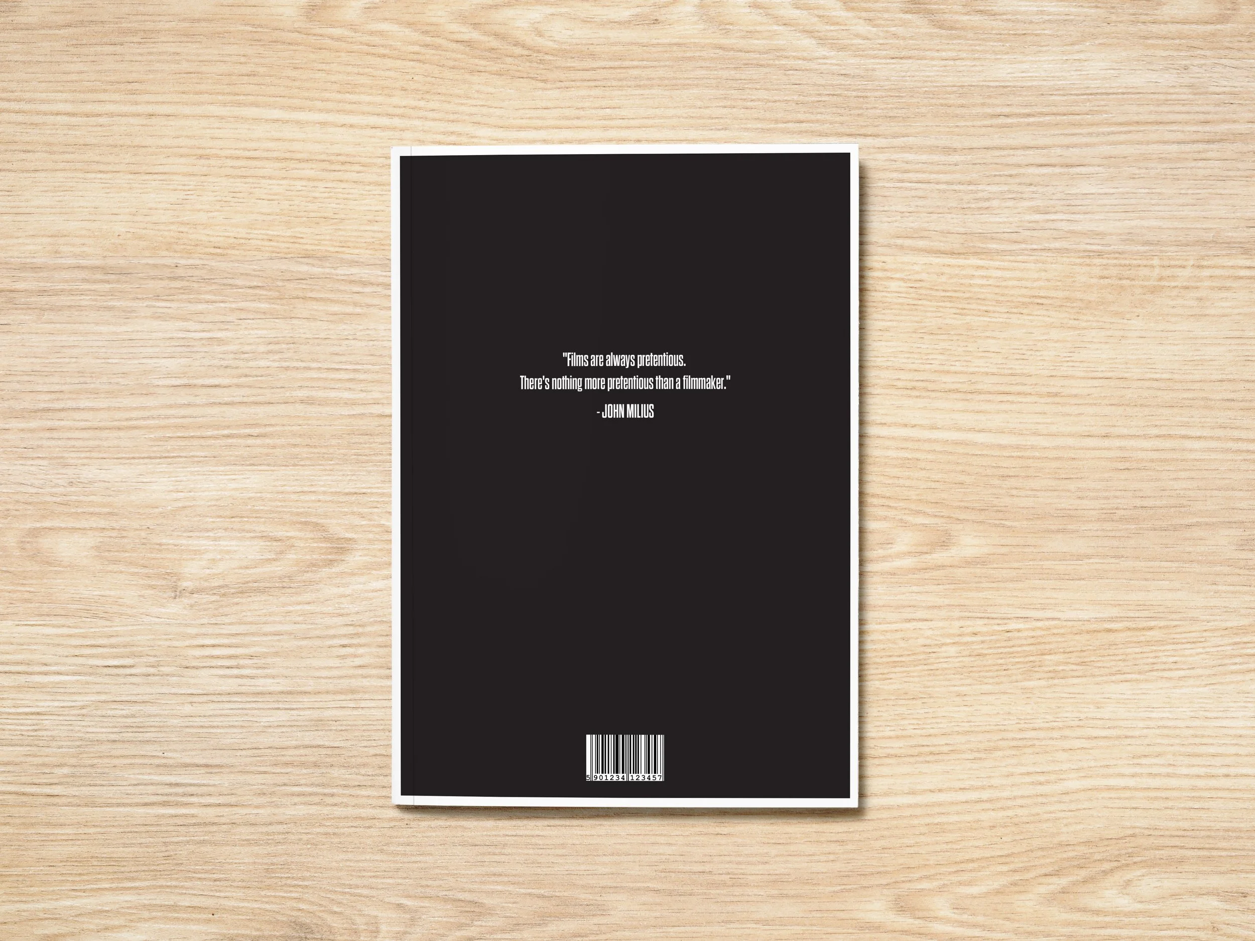
Comedic Film Journal.
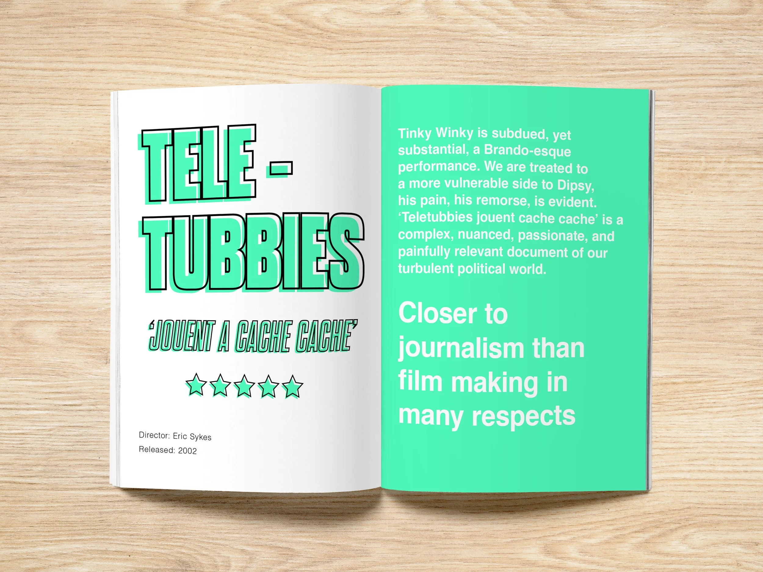
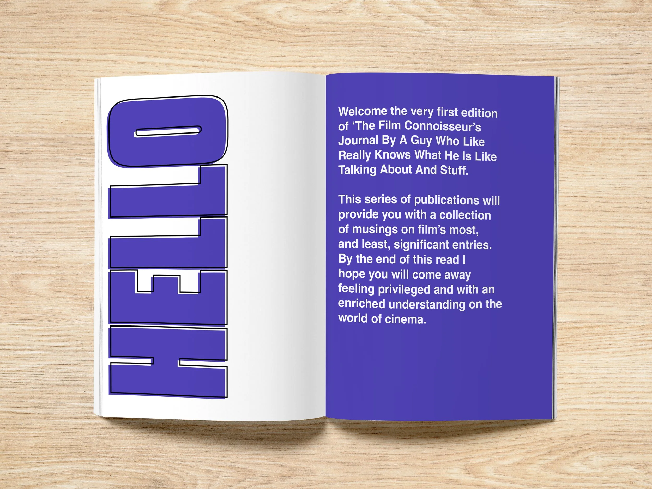
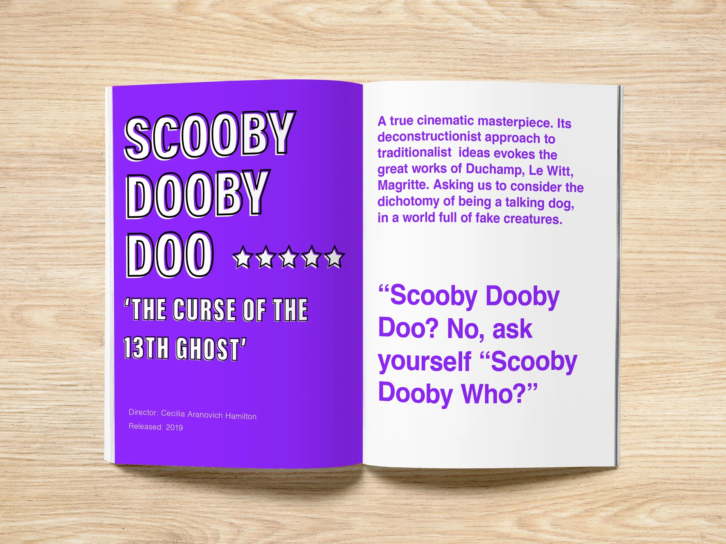
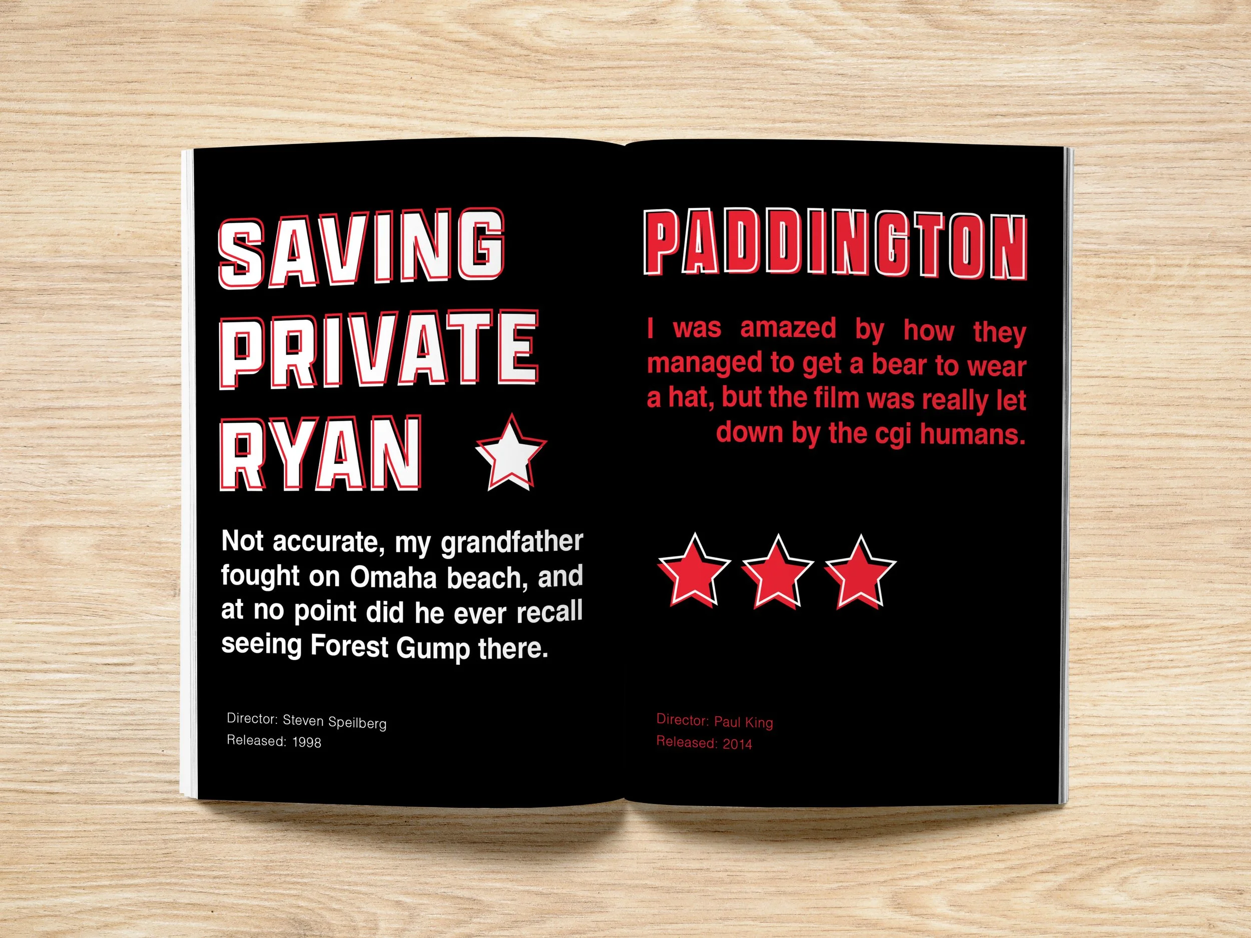
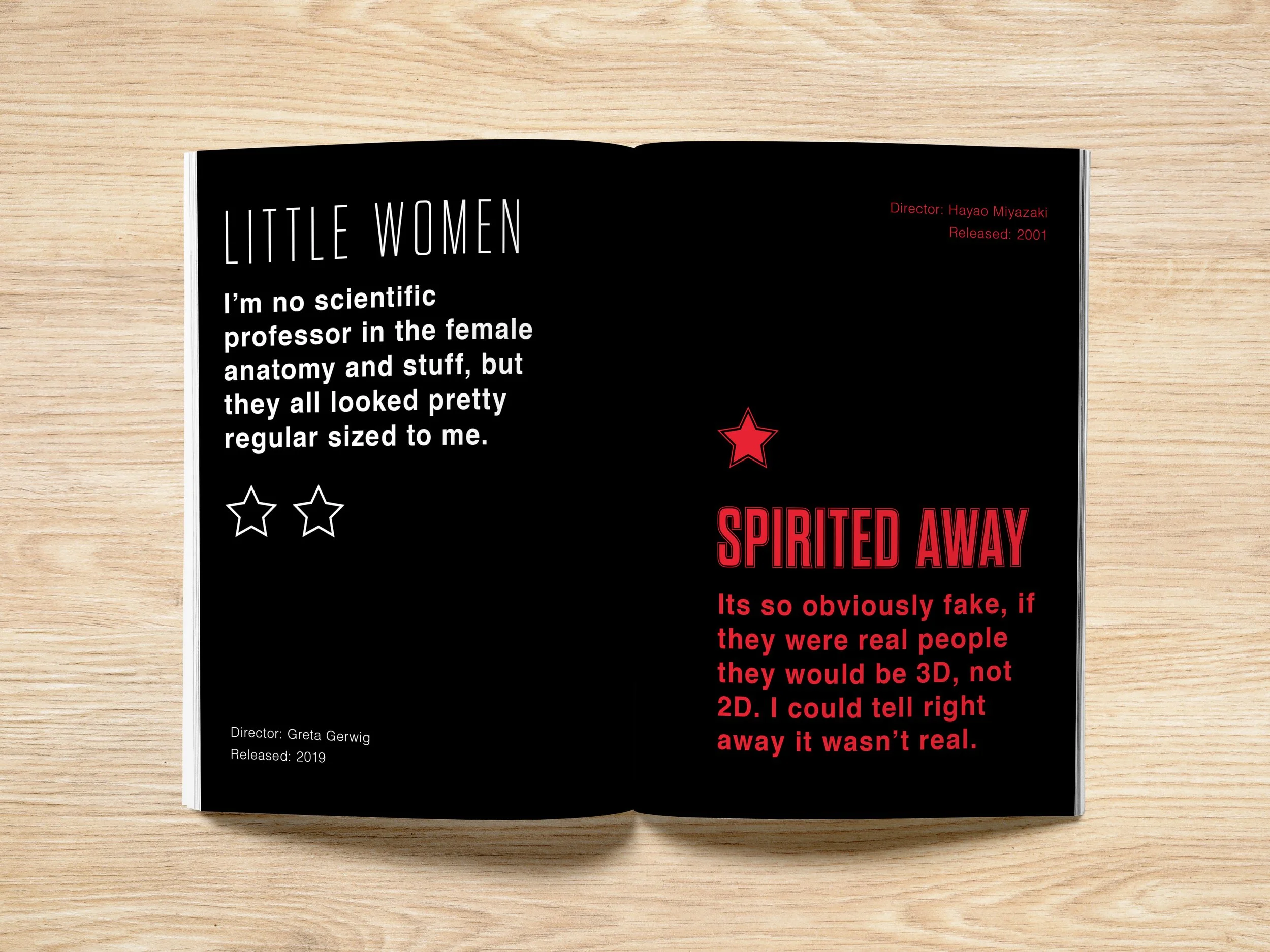
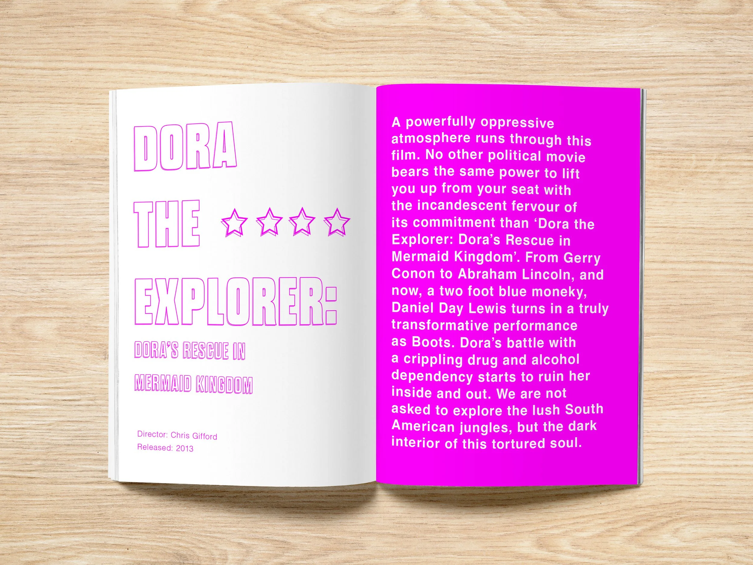
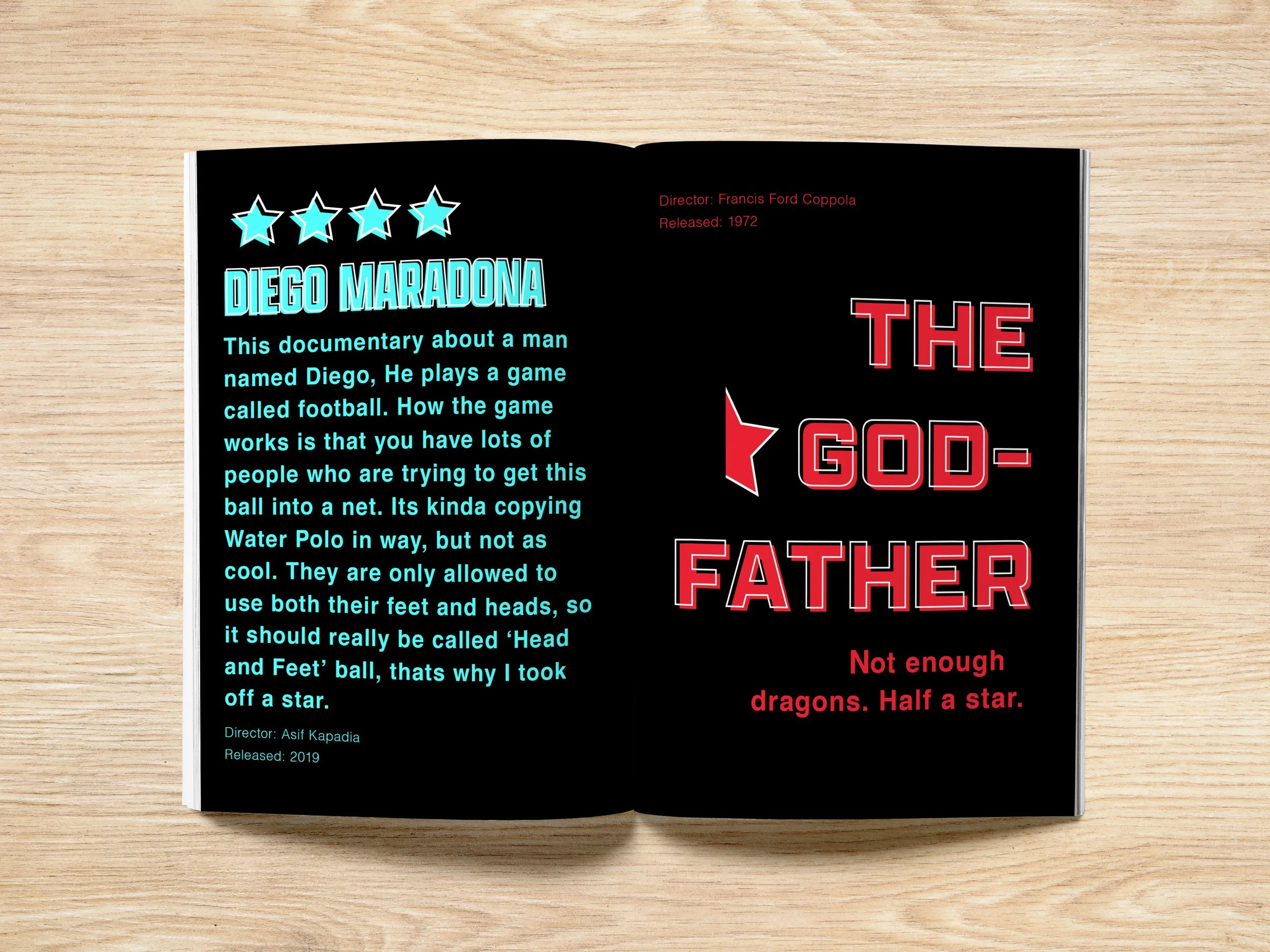
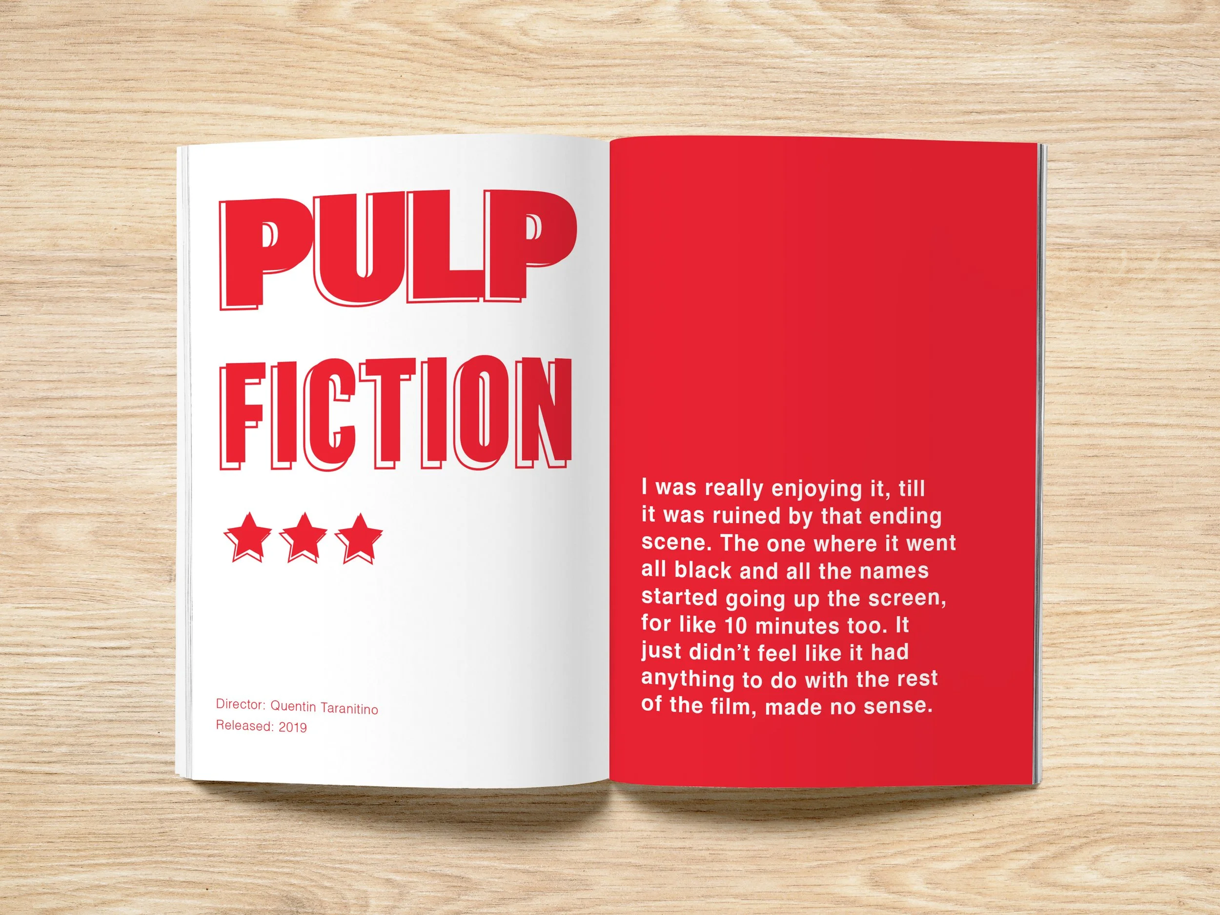
For this brief I created an absurdist comedy editorial, this was inspired by publications like The Onion and Private Eye. The idea was born from surrealist film critiques I had been posting on my Letterbox’d account, which I then developed into a full editorial.
Client : Me
Discipline : Editorial, Typography
Project Type : Magazine
The cover uses oversized typography and a shifting colour palette to establish the journal’s playful, absurd tone from the outset. The hourglass shaped title accentuates the comically long name of the magazine.
I borrowed a visual device from The Onion, using an oversized setup followed by a much smaller punchline to make the typography itself part of the joke. This becomes a recurring visual motif throughout the book, highlighting how design and content can become one.
Thank You!
I hope you enjoyed viewing my design portfolio. Now you can view my videography/photography work. This makes up another key part of my creative practice.